These are my comments about Twitterives that were not presented in class.
Kelly McLaughlin - Reading With Analisa
I love this. Right from the well-written prologue, I was emotionally involved. But with each new chapter, my investment grew stronger and stronger. The organization is spot-on relevant: content grouped in chapters alternately scientific and romantic. Clicking though them was like reading the pages of a book. The parts based on research reinforced my conviction that reading to children is important, and the pages with personal stories brought the concepts life in an emotional climax--almost like a story!
I was impressed with the screen captures of tweets in the prologue. They have rounded corners and shadows behind them, and I want to know how to do this. The page with the book covers was such a good idea and well executed. In Chapter 4, I loved the detail of the narrative, like the bookmark that came from Chuck E. Cheese. These details really help create a realistic and poignant scene.
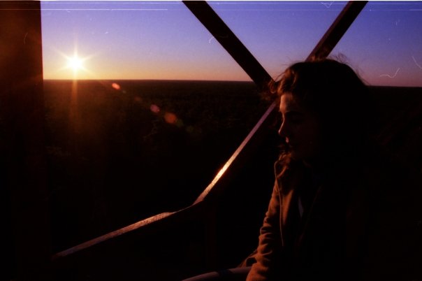
My only thoughts on revision: 1) I really hope that the interview to come is with Analisa. I feel like I almost know her, but want more. And if it is to be with her, I think putting it at the end is the right idea, like reading a book before you see the movie. And 2) I wanted to see a picture of you reading to her, or at least a picture of her face. This video would serve this purpose, and that might be enough. I like the pictures in the beginning, but they are distant and I kept remembering the picture that you have on your "About Me" page.
Pauline Tazewell - Love and Forgiveness
Wow, forgiveness is powerful stuff. I like the inclusion of "forgiveness is an action word" and that it is mentioned 145 times in the bible. This part of the Twitterive is powerful, and I can tell that the writer has experience talking about forgiveness. I think the repetend is strong: "I never gave up." But I wonder if it sets the right tone for forgiveness. It seems like there are maybe two sides to the story, the struggle and the release. "Love and Forgiveness" is perhaps the second part of the story; maybe the first part is naivety, deception, or bitterness. Maybe these themes would be better organized on two pages.
I like the inclusion of the soon-to-be husband. It serves as a happy ending of sorts, but I had two questions. First, what is the reasoning for including a "current" diary entry at the beginning? And second, I want to know more about Reeves. Maybe this isn't the point of the story; I don't know. Maybe including too much about him would detract from the forgiveness theme; however, I thought that he got brushed over: a quick diary entry at the beginning and a wedding invitation at the end.
Ashley Pfaff - Letters to God
Using the repetition of letters is an effective way of telling the story here. I like that, while most seem semi-fictionalized, a photo of a "real" one is even included. This technique reminded me of the way the classic young adult novel "Are You There, God? It's Me, Margaret" uses letters to God to set off chapters. I can follow the dynamic main character's transformation from "non-believer" to "uplifted" through the letters. I also like the comments under "Symptoms of Depression:" they're almost like tweets! Running thoughts, add another dimension.
I think my favorite part of this twitterive is the small instance of three photos. It looks like it's the same photo, only each is progressively darker, like sinking into depression. I was wondering: might this be repeated towards the end, only in reverse? A picture gets lighter and lighter? Lastly, I noticed just a few common mistakes ("you're/your," "are/our," "christian's/Christians") that once corrected, will keep the reader from being distracted from the story.
Lindsay Jones - Car Crash
The images here are effective; we see phone screens, a smashed car, a girl in the hospital. They illustrate the narrative so I could understand what it felt like a little better. When the pictures of the smashed car appear in the story, the crash has just happened and it is night. However, the pictures are taken in the daylight. It shows the aftermath, but not the moment. Obviously, no one is going to recreate a car crash to take pictures, but it would be interesting to experiment with some photography of fragments of the night: a blurry traffic signal, the torso of a man running to help. It might take readers further into the story instead of daylight photos that might take them further out.
Two other thoughts: 1) There might be too much back story. There are a lot of events leading up to the crash that seem irrelevent. One possibility is to try leading off with the crash itself and work in details as needed. In lieu of extended backstory, the recovery seems ripe for expansion. I wanted to know more about getting back in a car, what it was like to conquer that fear. 2) The story doesn't really have an ending. I wanted to know: Does Monica heal? Do they remain friends? What is it like to drive again?
Kelly McLaughlin - Reading With Analisa
I love this. Right from the well-written prologue, I was emotionally involved. But with each new chapter, my investment grew stronger and stronger. The organization is spot-on relevant: content grouped in chapters alternately scientific and romantic. Clicking though them was like reading the pages of a book. The parts based on research reinforced my conviction that reading to children is important, and the pages with personal stories brought the concepts life in an emotional climax--almost like a story!
I was impressed with the screen captures of tweets in the prologue. They have rounded corners and shadows behind them, and I want to know how to do this. The page with the book covers was such a good idea and well executed. In Chapter 4, I loved the detail of the narrative, like the bookmark that came from Chuck E. Cheese. These details really help create a realistic and poignant scene.
My only thoughts on revision: 1) I really hope that the interview to come is with Analisa. I feel like I almost know her, but want more. And if it is to be with her, I think putting it at the end is the right idea, like reading a book before you see the movie. And 2) I wanted to see a picture of you reading to her, or at least a picture of her face. This video would serve this purpose, and that might be enough. I like the pictures in the beginning, but they are distant and I kept remembering the picture that you have on your "About Me" page.
Pauline Tazewell - Love and Forgiveness
Wow, forgiveness is powerful stuff. I like the inclusion of "forgiveness is an action word" and that it is mentioned 145 times in the bible. This part of the Twitterive is powerful, and I can tell that the writer has experience talking about forgiveness. I think the repetend is strong: "I never gave up." But I wonder if it sets the right tone for forgiveness. It seems like there are maybe two sides to the story, the struggle and the release. "Love and Forgiveness" is perhaps the second part of the story; maybe the first part is naivety, deception, or bitterness. Maybe these themes would be better organized on two pages.
I like the inclusion of the soon-to-be husband. It serves as a happy ending of sorts, but I had two questions. First, what is the reasoning for including a "current" diary entry at the beginning? And second, I want to know more about Reeves. Maybe this isn't the point of the story; I don't know. Maybe including too much about him would detract from the forgiveness theme; however, I thought that he got brushed over: a quick diary entry at the beginning and a wedding invitation at the end.
Ashley Pfaff - Letters to God
Using the repetition of letters is an effective way of telling the story here. I like that, while most seem semi-fictionalized, a photo of a "real" one is even included. This technique reminded me of the way the classic young adult novel "Are You There, God? It's Me, Margaret" uses letters to God to set off chapters. I can follow the dynamic main character's transformation from "non-believer" to "uplifted" through the letters. I also like the comments under "Symptoms of Depression:" they're almost like tweets! Running thoughts, add another dimension.
I think my favorite part of this twitterive is the small instance of three photos. It looks like it's the same photo, only each is progressively darker, like sinking into depression. I was wondering: might this be repeated towards the end, only in reverse? A picture gets lighter and lighter? Lastly, I noticed just a few common mistakes ("you're/your," "are/our," "christian's/Christians") that once corrected, will keep the reader from being distracted from the story.
Lindsay Jones - Car Crash
The images here are effective; we see phone screens, a smashed car, a girl in the hospital. They illustrate the narrative so I could understand what it felt like a little better. When the pictures of the smashed car appear in the story, the crash has just happened and it is night. However, the pictures are taken in the daylight. It shows the aftermath, but not the moment. Obviously, no one is going to recreate a car crash to take pictures, but it would be interesting to experiment with some photography of fragments of the night: a blurry traffic signal, the torso of a man running to help. It might take readers further into the story instead of daylight photos that might take them further out.
Two other thoughts: 1) There might be too much back story. There are a lot of events leading up to the crash that seem irrelevent. One possibility is to try leading off with the crash itself and work in details as needed. In lieu of extended backstory, the recovery seems ripe for expansion. I wanted to know more about getting back in a car, what it was like to conquer that fear. 2) The story doesn't really have an ending. I wanted to know: Does Monica heal? Do they remain friends? What is it like to drive again?

 RSS Feed